Mailing Design Guide: Save Money by Meeting USPS Requirements
Direct mail remains one of the most effective marketing tools—but only if your mail piece meets USPS design standards. The United States Postal Service gives postage discounts because your piece is machine-readable and requires less manual handling. That means layout and dimensions directly impact your budget.
Why Design Rules Matter
When you drop a First-Class stamped envelope in the mailbox, the post office will deliver it—even if the address is handwritten in crayon. But bulk mail is different. To qualify for automation discounts, your piece must flow through high-speed sorting machines without human intervention.
Following USPS aspect ratio and addressing guidelines can lower your postage costs by 20–40%. Ignoring them can push your piece into a more expensive rate class—or even get it rejected.
Mailpiece Sizes and Aspect Ratios
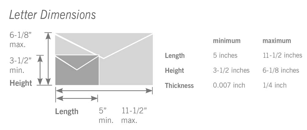
Letters
Minimum: 3.5″ high × 5″ long
Maximum: 6.125″ high × 11.5″ long
Thickness: 0.007″–0.25″
Aspect ratio: length ÷ height must be between 1.3 and 2.5

Flats (large envelopes)
Minimum: 6.125″ high × 11.5″ long OR thicker than 0.25″
Maximum: 12″ high × 15″ long × 0.75″ thick
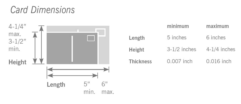
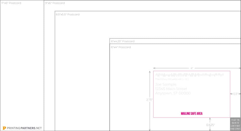
Postcards
Minimum: 3.5″ high × 5″ long × 0.007″ thick
Maximum (for postcard rate): 4.25″ high × 6″ long × 0.016″ thick
Larger postcards up to 6.125″ × 11.5″ are mailable, but they qualify as letters and cost more postage.
The Mail Panel: Common Pitfall
The most frequent design mistake is not reserving enough clear space on the back of a 4″ × 6″ postcard. To qualify for automation discounts:
Leave at least 4 inches of the card’s width for the address panel.
That space must be free of graphics and text except for the address, barcode, and indicia. Smaller decorative spaces may work with stamps, but automation requires this clear zone.
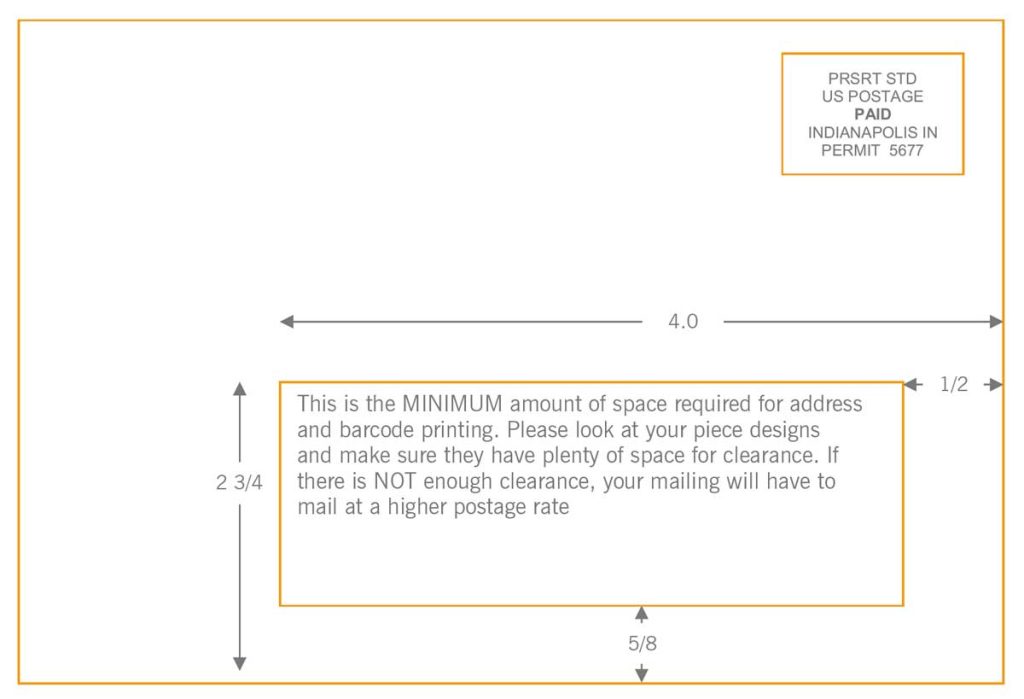
Indicia and Permit Imprints
For bulk mail, the postage imprint (indicia) replaces individual stamps. Placement is standardized:
Top right corner, at least 1/8″ from edges.
Different indicia formats apply for First-Class, Marketing Mail, or Nonprofit rates. Using the wrong format can delay delivery.
Design Tips for Automation Success
Keep the address block level: avoid angled text.
Maintain high contrast: black type on white is ideal.
Leave quiet zones: 1/8″ around barcode and address areas.
Avoid glossy coatings in the barcode zone.
Tabs for self-mailers: folded pieces often require wafer seals.
Practical Examples
First-Class Stamped Piece: You can decorate freely, use script fonts, or handwrite the address. It will be delivered, but you’ll pay full postage.
Presorted Standard Mailer: Must have machine-readable address block, proper aspect ratio, and clear barcode zone. Following rules means saving cents on every piece, which scales to thousands of dollars on large campaigns.
Tips (from USPS Design Guidelines)
Place the return address in the top left.
Avoid placing text or images behind the address panel.
When designing folded self-mailers, keep final folded size within letter specs and use tabs per USPS tabbing chart.
Plan your layout so coupons, images, or headlines don’t land in the mail panel space.
Download the Free Template
Avoid guesswork and rejected mailings. Download the free USPS Mail Panel Template below. Place it into your InDesign, Illustrator, or PDF layout. This will help you see your safe zone before sending files to print.